

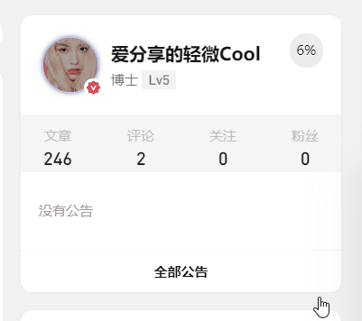
效果展示
代码
/*头像呼吸光环和鼠标悬停旋转放大*/
.avatar {
border-radius: 50%;
animation: light 4s ease-in-out infinite;
transition: 0.5s;
}
 .avatar:hover {
transform: scale(1.15) rotate(720deg);
}
@keyframes light {
0%{box-shadow: 0 0 4px #f00;} 25%{box-shadow: 0 0 16px #0f0;}
50%{box-shadow: 0 0 4px #00f;}
 75%{box-shadow: 0 0 16px #0f0;}
100%{box-shadow: 0 0 4px #f00;}
}
本站文章大部分为原创,用于个人学习记录,可能对您有所帮助,仅供参考!